Input UI improvements
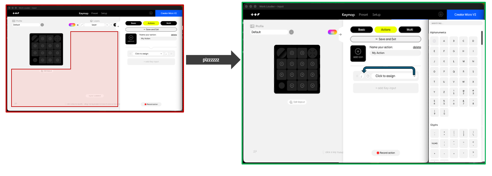
Idea: Improve ‘Actions’ and ‘Multi’ tabs to allow individual key assignments to be done via the icon grid, rather than selecting from the nested drop down list.
The drop down list is ‘hard’ to navigate:
Key names are often truncated (shared sentiment with existing feedback posts)
Drop down list shows 5 selectable keys in view while 10 section labels are always visible —> only 1/3 of the 'rows’ are actionable
Feels sluggish for the core feature
IMO, it would be much easier to select keys from the icon view that’s already used when assigning keys from the ‘Basic’ list to Framer. Screenshot below shows how much unused space is available and how this could fit cleanly (says the non-UI guy making mocks in Excel).
2 less clicks per key assignment, ∞ less scrolling (NOW that’s what I call IMPACC)
More direct, less navigation
Visible keys per view go from 5 —> 40+
Consistent UI for all 3 tabs
Appeases that 1 annoying customer who made 3 posts in one day
- Product
- Input, Creator Micro v2
Log in to comment and vote
Comments5
Davide // Work Louder
Jan 8
Hi @Scott Lanning thanks for your feedback! As I confirmed on the other post, we are working on a big redesign which will improve the UX.
Samuel Gregory
Dec 18, 2025
Agree on the bad UX.
At the very least to be able to type the key you want to assign from a ‘search’ in the dropdown.
Saying that, I mostly record my inputs anyway.
Scott Lanning
Dec 22, 2025
The multi tab doesn’t have the ‘record’ feature so this would only apply to interacting with default keys and user defined action keys.
I think action folders are coming soon which will def help but my main gripe can be attributed to the drop down list we are forced to use. I prob went overkill on proposing a UI solution but really hoping to see a more efficient design whether it be redesigning the drop down UI or some other change that doesn’t require the drop down to be used in the first place.